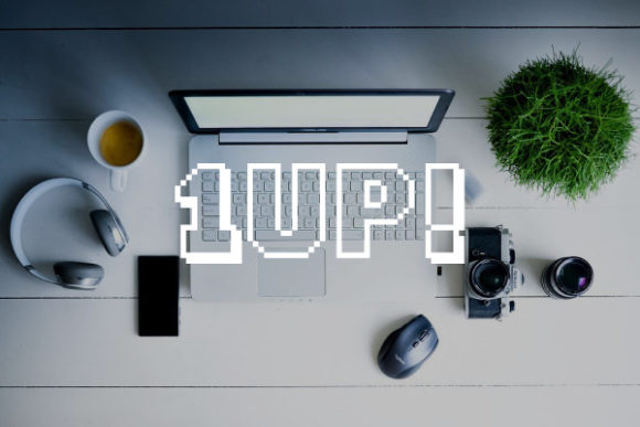
1Up Display Font for Modern Web Design
As a UI designer who builds landing pages, SaaS dashboards, and e-commerce experiences daily, I’m selective about display fonts — not just for aesthetics, but for how they shape user perception, guide attention, and reinforce brand voice. 1Up stands out as a rare balance: futuristic without feeling cold, bold without sacrificing legibility, and distinctive without overwhelming layout rhythm. It’s a display font that works *with* digital interfaces — not against them.
Visually, 1Up features clean geometric forms, subtle angular terminals, and consistent stroke contrast. Its letterforms are open and airy, with generous x-heights and well-proportioned counters — traits that directly support readability at larger sizes on screens. Unlike many experimental display fonts, 1Up avoids excessive distortion or decorative flourishes that break down on mobile viewports or small CTAs. That makes it unusually versatile for real-world web use: hero headlines, section dividers, product name tags, and even short-form buttons when sized appropriately.
In practice, I reach for 1Up when the goal is to signal innovation, creativity, or forward-thinking energy — without leaning into sci-fi clichés. A boutique online store selling sustainable tech accessories uses it for their homepage banner headline (“Your Next Step Up”) over a muted gradient background. A coding bootcamp deploys it in their course sales page header (“Level Up Your Career”), paired with a neutral sans serif like Inter for body text. In both cases, the font contributes to visual hierarchy by drawing the eye first, then handing off smoothly to supporting copy.
For conversion-focused layouts, placement matters. 1Up performs best at scale: 48px and up on desktop, 32px+ on mobile — especially when used over high-contrast backgrounds. I avoid using it below 24px, even in headings, because its character spacing and geometry aren’t optimized for tight line heights or dense paragraph settings. It’s not a body font, nor a navigation typeface. But as a strategic accent? Extremely effective. On a portfolio site, it elevates project titles without competing with imagery. In an email banner or social ad graphic, it delivers instant recognition and tone — critical for scroll-stopping clarity.
Readability holds up well across contexts. On light backgrounds, it’s crisp and confident. Over dark mode interfaces or image overlays, I add subtle text shadow (1px black at 30% opacity) to maintain contrast — a quick CSS tweak that preserves its impact without compromising accessibility. On mobile, I pair it with responsive viewport units (e.g., clamp(2rem, 4vw, 3.5rem)) so scaling feels intentional, not cramped. And yes — it renders cleanly across Chrome, Safari, Firefox, and Edge, with no rendering hiccups I’ve observed in production.
Font pairing is where 1Up shines most thoughtfully. Because it carries strong personality, it pairs best with highly legible, low-contrast sans serifs — think Inter, Manrope, or even system fonts like -apple-system for maximum performance. For editorial or coaching sites aiming for warmth and authority, a restrained serif like Cormorant Garamond (light weight) creates elegant contrast: 1Up for section headers, the serif for pull quotes and long-form content. Avoid pairing it with other display fonts or scripts — the visual competition dilutes its impact.
This is a freebie, yes — but don’t mistake accessibility for limitation. The included files cover standard OpenType (.otf) and web-optimized WOFF2 formats, making self-hosting straightforward. There’s one weight (Bold), no italics or alternates — which is actually ideal for focused digital use. No need to manage multiple weights when your goal is consistency across breakpoints and platforms. Multilingual support covers Latin-based languages thoroughly, including accented characters used across Western European markets — essential if your landing page targets global audiences.
Licensing is practical and clear: free for personal and commercial use, including client websites, online stores, SaaS apps, digital templates, and brand assets — no attribution required. That means you can embed 1Up in a Shopify theme, use it in Figma design systems for client handoff, or ship it as part of a Notion template bundle. Just verify the license file included with your download, as terms may vary slightly across distribution channels. If you’re building white-labeled products or reselling design assets, double-check usage scope — but for nearly all web design work, it’s safe and scalable.
I’ve tested 1Up across dozens of real projects: a wellness app’s onboarding flow, a micro-SaaS pricing page, a photographer’s portfolio hero section, and even a limited-edition digital product launch. In every case, it reinforced brand tone without demanding extra design labor. It doesn’t require custom kerning adjustments, doesn’t clash with iconography, and scales predictably in CSS Grid and Flexbox layouts. That reliability — combined with its distinct yet professional presence — is why it’s now in my go-to toolkit alongside trusted workhorses like Inter and Roboto.
What sets 1Up apart isn’t novelty — it’s intentionality. Every curve, angle, and spacing decision supports how users scan, interpret, and emotionally respond to digital space. It doesn’t shout; it invites. It doesn’t distract; it directs. And in an era where typography is a core part of UX, that’s not just nice to have — it’s foundational.
- Best for: Hero titles, section headers, CTA banners, logo lockups (short names), digital ads, course or product name displays
- Avoid for: Body copy, navigation menus, data tables, form labels, small mobile buttons (<20px)
- Pair with: Inter, Manrope, Lato, or system sans serifs for UI clarity; Cormorant or Playfair for editorial contrast
- Optimize for: High-contrast backgrounds, responsive sizing, WOFF2 delivery, accessible color contrast (4.5:1 minimum)